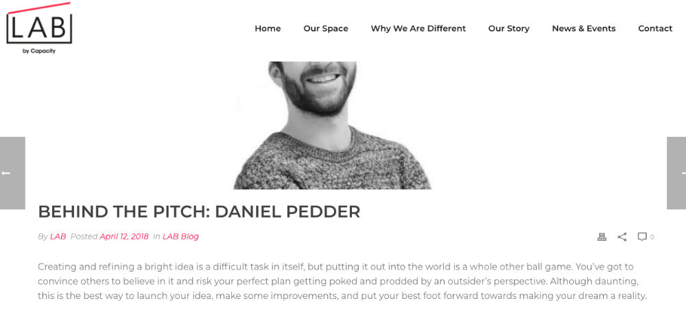
This is a repost from my company’s blog on Remove Duplicates.

“I still recall the moment I wrote the first line of code of what would then become Remove Duplicates… I never imagined in my wildest dreams that the add-on would end up being used by over 100,000 people and trusted by some of the biggest brands in the world.”

See a need, fill a need

Before Remove Duplicates existed there were already a few add-ons out there to help clean data in Google sheets. But the majority of them were either clunky, gave inconsistent results, slow or required signing up for a separate account! Now given the work I was doing at the time, none of these add-ons ticked my needs; easy to use, fast at cleaning, correct and quick to startup.

As someone who enjoys solving tough problems and being a software developer myself, I felt I could do better. It was time to get up to speed on Google’s JS framework, Google apps script and dive right in. I still recall the moment I wrote the first line of code of what would then become Remove Duplicates. At that time, the out-of-box experience when developing an add-on was pretty clunky but I managed to get a prototype up within a day or two, followed by a stable release within a week.

Welcome to the Store

The add-on worked great; I was cleaning data in record time and it was at that point I wondered if others might enjoy using it too. There was only one way to find out. After a week of building out a payment system, writing the marketing copy, designing some branding and squashing the last few bugs, I submitted it to the Google add-on store. Google have a pretty strict QA process, so I anticipated some minor requests for tweaks but all was well and it passed with flying colours.

The add-on was live for the world to see.

An hour had passed and then suddenly, I got my first user. You never forget your first. It was around 2:30 pm on a warm Spring afternoon. Knowing someone somewhere in the world was using the add-on that very moment was such a great feeling. But then a flurry of questions flooded my mind. Would they like it? Would they find bugs and leave a poor review? Would they use it more than once? But the biggest question I had, would it be a success?

Did you say 1000?

By 10 pm that evening I had hit over 100 users. The next day, 400. By the end of the week, the add-on had around 1000 users. With around 90% using the add-on more than once and a bunch turning into customers. Safe to say, I had a few beers that weekend.

Since launch, growth has continued month-on-month with no signs of slowing down, netting some big brands along the way such as Google and Netflix. The add-on has gone through multiple UI revisions, new features added and constant improvements to the algorithms that power the cleaning process.

Thank you…

…to everyone who has put trust in our add-on. I never imagined in my wildest dreams that it would end up being used by over 100,000 people and trusted by some of the biggest brands in the world. It’s been great speaking to our many customers, finding out about all the different ways Remove Duplicates is helping them in their day-to-day.

I’d like to close with a great saying from the movie Robots, that has stuck with me ever since I heard it back in 2005, “See a need, fill a need”.

If you’re wondering what it takes to create a great user experience, read on.

This’ll be a 4 part series exploring just a few of the elements I consider key to designing a great user experience. While I’ll be focused mostly on software, these concepts are industry agnostic, so whether you’re a photographer, service provider or a manufacturer, there’ll be something to take away.

  • Emotion. How does your product or service make your users feel? Understanding your user’s emotions is the foundation to creating a great experience.
  • Interaction. How easy can your users achieve their goals? Intuitive and easy to use interfaces are what let users get to where they need to go. Reducing friction at all times should frame your design decisions.
  • Sensory. How well does your product infuse the user’s senses? From colours, shapes, tone, movement, sound, smell and touch. All these contribute to a user’s sensory experience which help boost loyalty and product advocacy.
  • Function. Does your app reliably perform its key task? Does your product feel of a high quality? Is it great value for money? Does it feel premium? Is it fast at performing a task? Regardless of how fancy an app may look, an app must serve it’s purpose well.

Emotion

Emotion is any conscious experience characterized by intense mental activity and a certain degree of pleasure or displeasure.

Wikipedia

If you think back to the last time you interacted with a product or service you most likely came away either feeling happy or thinking things could have went better. Human emotions are a vast complex system, made up of millions of pathways each carrying our nuanced thoughts, which when reflected on generally lead to a feeling we can categorise as either good or bad. 

Hopefully that’s your customer on the left.

While a hard metric to directly quantify and measure, how a customer feels when using your app is core to achieving a great user experience.

Achieving a great product experience starts with measuring how well your design achieves the core use cases. Remove yourself from this equation unless you’ll be an activate user of the service (which you should be) and become the end user when assessing each use case. It’s easy to design an app that you love, but will your users love it?

A quick and effective way to get started exploring this would be to look at the effort required to achieve your app’s use cases. Start by creating a simple 2 column layout, on the left list the app’s use cases and on the right list the steps you anticipate your users will take. With these mapped out, starting thinking about:

  • Can you reduce the steps? As we live in an age of always-on and instant feedback, the less steps the better.
  • Is the journey to achieving a goal enjoyable? Thinking about the common adage that the journey matters more than the destination, think about the last trip you took or task you completed, if the journey wasn’t enjoyable, I bet you won’t be looking forward to doing it again.
  • Is the UI intuitive and easy to navigate? Too much choice could be overwhelming for some users, thus leading to an experience they’d prefer not to repeat or even attempt.
  • Having achieved the goal, will the user be happy? You don’t need to shower the user’s screen in confetti and play annoying sound effects but, given the nature of the task at hand, will the users feel satisfied with the outcome? Depending on the device and app, subtle use of visual notifications and feedback can drastically enhance the experience of achievement.

First to mind wins

These should be enough to get you started on a path to effectively understanding how a user will feel when using your app. It’s important to start asking the questions early on, as they will afford you many opportunities to “right the ship” during development and ensure you create an experience your users won’t forget.

When it comes to pitching (Not the baseball kind…) for the first time, whether to your boss for that pay rise you deserve, to investors for a new idea or getting a loan from your bank manager, it can seem at first incredibly daunting but it doesn’t have to be and you might find you actually enjoy it.

Throughout my career I’ve pitched to many and in varied situations and the number one thing that’s helped me succeed in every situation is being prepared. Have you ever watched an episode of Dragon’s Den were a dragon grills someone who’s asking for a few million quid to fund their venture only to fold when asked basic questions about their business? A little bit homework can go a long way.

To help guide you, I’ve written a few key questions that any pitch should be able to answer. I used these very same ones to prepare and win Lab’s pitch battle night.

What are you pitching?

It shouldn’t take you more than a few sentences to explain your business idea. If it’s taking you longer, then spend some more time on refining your USP until the messaging is crystal clear.

What’s the problem you’re solving?

Without a pain point, there is no business. What is the pain for some customer out there that you are solving, and how? Also if your idea appears to be catering for a market that doesn’t exist and you feel no one has done your idea before, now is the time to question all your assumptions you’ve made up to now, to understand why that is. This will be asked during the pitch.

How will you make money?

What’s your go-to-market strategy? How will generate revenue? What will your cost structures look like? What are your competitors making? These are just a few questions you may be asked so have a stab at running through the numbers you anticipate in terms of revenue, profit and costs.

While all numbers at this stage are merely hypothetical, don’t forget that these are all someone can go on when deciding on whether to invest in you or not so make sure they make sense. Double, triple and quadruple check those numbers!

Timeline to market?

When will you launch? A rough timetable of when you anticipate you can go to market will help a would be investor judge if this is a worth investment or not

CTA

An investor is keen so what should they do next to research more, ask questions and hopefully help you launch the next big thing? Always include a Call to Action so your listeners can follow up with you.

That’s it!

That’s all there is to creating a super simple and succinct pitch that should get any would be investor listening. Put 10 minutes aside and in broad strokes answer the above, refine and continually practice until it becomes almost second nature.

As I’m writing this, I have the Mac hooked up to a 24inch external wall-mounted display. Mail, Calendar, Trello and Grammarly all open fullscreen on their own desktop. Spotify pumping, Docker silently running a bunch of containers, a party of 20 tabs open in Chrome (I know …) and an instance of Xcode open.

All this and the experience when swiping between desktops and switching apps is silky smooth.

Adios, Windows

From developing software to running my company, this lone MacBook Air handles it all. As a Windows veteran of 10+ years, I had never experienced what I now feel when I use a Mac. Let me be clear that I’m no Apple fanboy who lavishes everything Apple does with accolades. Quite the opposite in fact; hello butterfly keyboard. 

But I can’t deny that the experience has been unmatched, before and since I first hit that power button and fired it up for the first time back in 2013. What an absolute joy.

Ask more of your tools

In any craft, the artisan should strive to use tools that don’t get in their way and if possible, add additional value past what their design intends. I suppose this is why those who practice bushcraft will opt for a custom-made axe vs an off-the-shelf one or someone who prefers to write with a Parker pen over a Bic. They both achieve the same outcome but tools should be more than just a function, they should feel seamlessly connected and make you feel good when used.

This Mac does that for me. Arriving at my desk, coffee in hand I hit the spacebar, enter my password, hit play on Spotify and a day of creating begins. Looks-wise the MacBook Air has aged pretty damn well. The full-body aluminium finish is as smooth and polished as the day I bought it. The screen is crystal clear and bright, and the keyboard and trackpad are still by far the best in its category.

And that’s why

My 2013 MacBook Air is truly the greatest machine I’ve ever owned. Apple designed a machine that doesn’t get in my way but instead, invites me in.

For those shopping for something built to last, do not require an 8 core powerhouse and are on a budget, then look no further. These days you can pick one up for around £250 on eBay.

Your revenue 💰

There are many factors that drive the success of an e-commerce store and in this short article, I’m going to go over 3 in particular that you absolutely need to understand, to help frame your next revenue-boosting strategy.

To begin, we’ll think about something called the “exponential effect”. When we increase or decrease a factor of a formula, the end result gets exponentially bigger or smaller. In terms of an e-commerce store, let’s look at the key factors and formula that govern revenue.

The 3 Key factors

  • Traffic – How many visitors did we get on our site?
  • Conversions – What percentage of visitors converted into a sale?
  • Avg. order value – What is the average spend per order?

When multiplied together, we can predict potential revenue:

Traffic * Conversion rate * Avg. order value = Potential revenue

This is powerful. You can now easily see how efforts focused on a factor, affect the bigger picture. Now if we think back to the concept of the “exponential effect”, let’s run through a real-world example:

Here, I’ve forecasted 20,000 visitors next month, with 2% converting to a sale and with an avg. order spend of £98.

20,000 visitors * 2% conversion rate * £98 Avg. order value = £39,200

Cool, we can now predict what revenue we should get next month. Now, what happens if we increase the conversion rate by 1%?

20,000 * 3% * £98  = £58,800

That’s a revenue increase of 50%! What if we decide to run an ad campaign to pull in more traffic as well?

45,000 * 3% * £98 = £132,300

Our forecasted revenue has now increased by 238%! By simply adjusting those 2 factors we take advantage of the “exponential effect”.

Next steps

Of course, these are just examples that don’t take into account how you actually run a successful ad campaign to drive high-quality traffic or how to improve your store’s conversion rate by 1%. However, by framing your decision making around this simple yet powerful formula, you’ll gain a clearer picture of the potential return on any campaign, strategy or tactic you put in play.

So next time you’re thinking of a way to boost revenue, take a moment to think how it fits in with the formula.

Traffic * Conversion rate * Avg. order value = Potential revenue